How we created a dashboard on internet speed in Europe
The dashboard on the average internet speed in Europe created by OBC Transeuropa for EDJNet is based on data provided by Speedtest by Ookla Global Fixed and Mobile Network Performance Maps, based on analysis by Ookla of Speedtest Intelligence data for the first quarter of 2022.
The data consists in a gridded spatial data frame. Every tile of the grid contains several internet speed measurements, voluntarily sent by users through the Speedtest platform.
Joining tiles with European administrative units
In order to get a sense of the state of internet speed across Europe, I joined Ookla data with the shapefiles of Europe’s Nomenclature of Territorial Units for Statistics (NUTS), and Local Administrative Units (LAU).
The values of download speed, upload speed, and latency for each administrative unit were obtained by calculating the average of all the observations within the administrative unit’s boundaries, weighted by the number of tests. Average download and upload speed values are expressed in megabit per second (Mbps), not to be mistaken with megabyte per second (MBps). Average latency values are expressed in milliseconds (ms).
Matching municipalities (LAU) with regions (NUTS 2)
To match European municipalities with higher administrative units I relied on the systematization of Eurostat correspondence tables made here by EDJNet. In this way I could assign European cities to their respective sub-national level administrative units and compare the differences among European regions.
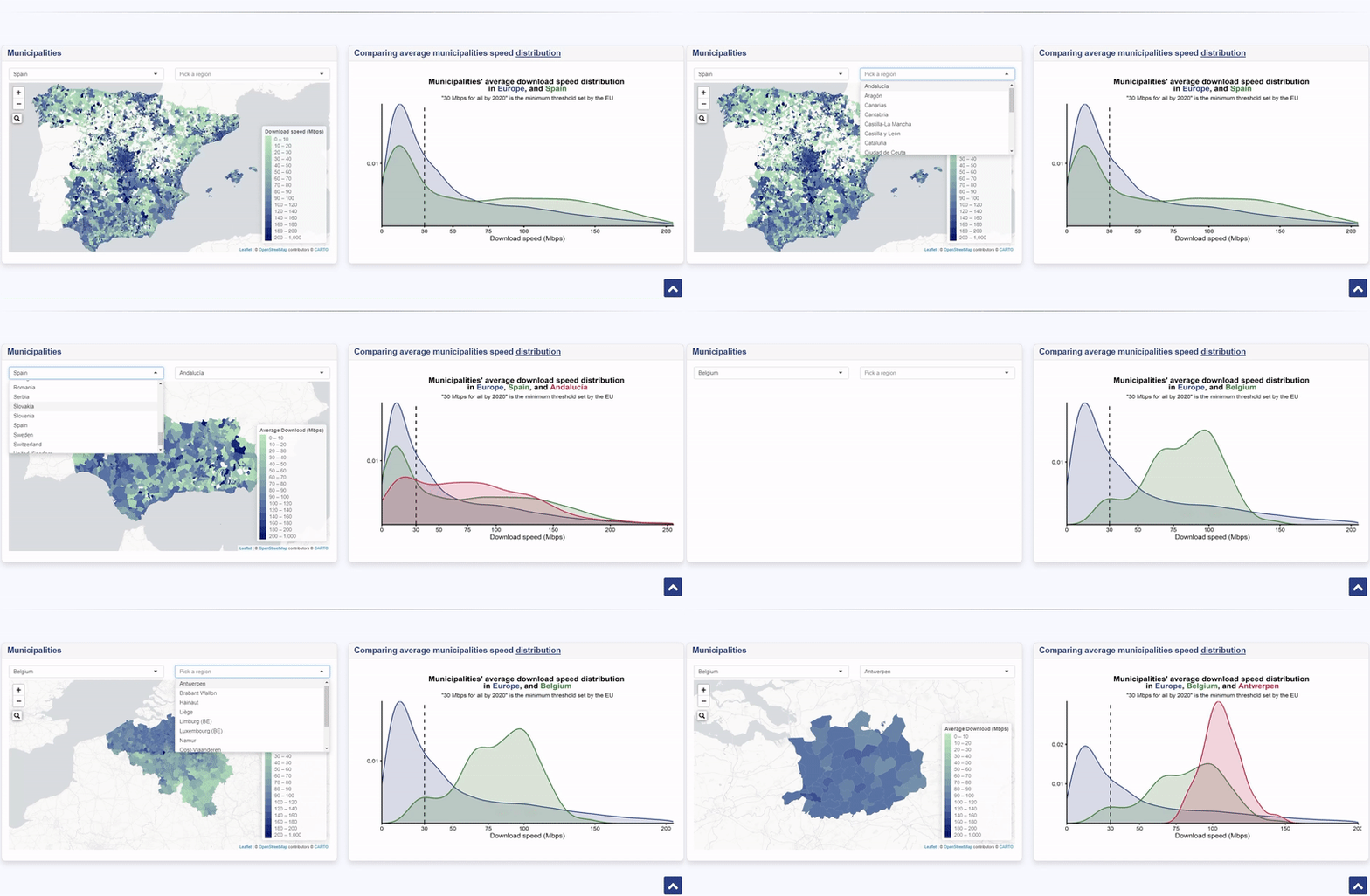
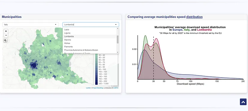
This matching makes it possible to compare European regions both intranationally and internationally. It is possible to browse a map with all the municipalities within a given region, as well as to observe the distribution of the average internet speed in the municipalities of a given region and compare it with the distribution of average speed in the other municipalities of the same country as well as in Europe as a whole.
Mapping
In order to generate the maps for every European region I used a simple loop and saved the maps as html files.
Why are legend scales the same for every map?
The distribution of European municipalities’ average download speed is right skewed.
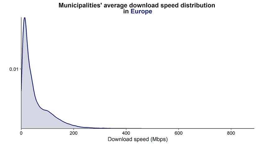
In order to find a compromise between completeness of information and readability, every map has the same legend scale values. This choice has been made in order to prevent the cognitive dissonance that could be engendered by having a given download speed value coloured in green in a map, and in blue in the following one.
In other words, in many maps most of the values that appear in the legend are not plotted because every download speed value is associated with the same colour gradient across the dashboard.
Density plots
These plots show the distribution of the European municipalities’ average internet speed, comparing the distributions of up to three different geographical levels: European, national, and regional.
Given the European municipalities’ distribution shape, the x axis has been limited to 300 Mbps if in the regional subset of data there are no cities with average download speed values higher than 300 Mbps. Whereas if there are values higher than 300 Mbps, the x axis is limited to 350 Mbps. Also, if the region consists in one city, as in the case of Berlin, it is plotted as a segment.
The dashboard
The last step was to join all these elements in a dashboard to make the data available and fully accessible to everyone, making it possible to have a look at the differences in internet speed across European regions…
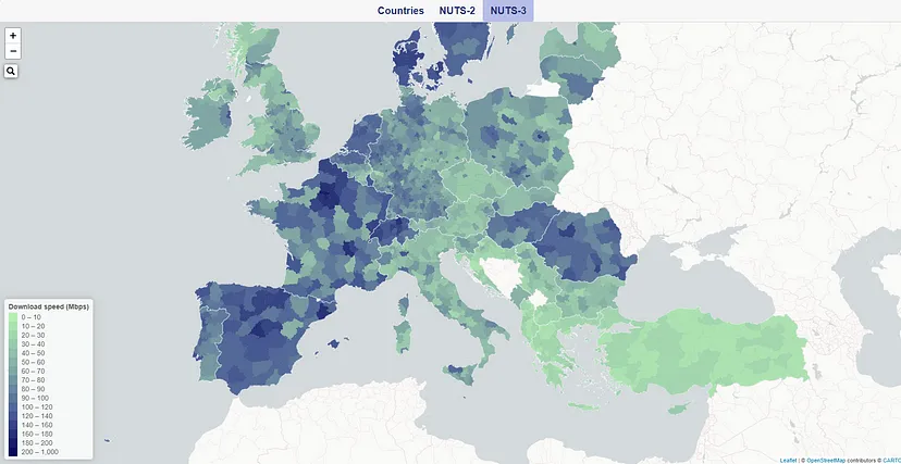
…and at the municipalities’ internet speed within single European countries.
