How to use Google Earth Studio to visualise data
Google Earth Studio is a fancy tool that allows for the creation of videos of stunning quality, by making it possible to create smooth transitions between locations across the globe, zooming in closer to the ground, and showing mountains and cities in 3D.
Here is their own promo video:
However, so far I have not really seen it used for data visualisation, nor I have seen any post online discussing how to use Google Earth Studio with data. So… I decided to give it a try, and report back.
In this post, I will describe how I made this video:
Do enjoy it in full screen. If you are here just for the action, you may want to skip past the first couple of minutes.
This post will be something in between a product review and a collection of points of reference that may be of use to anyone tempted by the idea of using Google Earth for data visualisation. The workflow described in this post is less than ideal, but perhaps this can still be useful as a starting point for someone considering to give it a spin.
In order to use Google Earth Studio, some familiarity with video editing software will be useful. Their own documentation is mandatory reading to to get started. Taking the time to get some basic understanding of how camera movement works in the online interface will spare much frustration going forward.
If you have data in the format used by Google Earth (.kml), or already know how to convert data into it, you can skip the following section detailing how to convert data to .kml with the R programming language. If you are unfamiliar with R, but still want to read more about Google Earth Studio, you will also probably want to skip the following section.
Getting the data into Google Earth
Exporting geographic datasets from R into a format that can be used in Google Earth Studio and customising their appearance is not a straightforward process, at least in part due to the scarcity of dedicated documentation and tutorials. Not all features of kml files are accepted by Google Earth, and none of the major packages for geocomputation with R have dedicated functions aimed at facilitating export from R to kml. After somewhat struggling with plotKML, I decided to fall back on a package that will be much more familiar to anybody using geographic data in R: sf (if you are unfamiliar with analysis of geographic data in R, the book Geocomputation with R is a great point of reference).
sf makes it easy to get data into R and process them, but leaves data export to other libraries, in this case libkml via rgdal with some customisation available through ogr_style. These are all documented, but do not interoperate smoothly, and one is left figuring out via trial and error which parameters will successfully make their way from the sf object to the exported kml. Some parameters seem to get lost between ogr_style and libkml, some kml features are not recognised by Google Earth, and troubleshooting is complicated by the fact that it requires some familiarity with the different underlying standards involved.
In the end, I made a couple of convenience functions that allow for exporting sf objects into kml files, facilitating basic customisation such as line and fill colour, text size, and such, using available export functions. When I could not get those producing the desired result, I reverted to processing bare xml. This now all happens under the hood with the dedicated functions that are now part of the latlon2map package.
Another complicating factor came from the fact that in Google Earth text labels are supposed to always be accompanied by a symbol (by default, this is an ugly yellow pushpin). Unfortunately, there is no easy way to disable symbols. A workaround is to set the scale of the symbol to 0, but the text will still appear on the top-right corner of the given coordinates. I have not found a way to have them centre-aligned, so I ended up manually adjusting the location of the points to give the impression that the label is at the centre of a given shape — in this case, at the centre of a given grid cell (see the code for details).
Besides, there is not an obvious way to change the altitude of geographic object in sf, which is sometimes necessary when working with Google Earth Studio for the reasons described in the next section. Eventually, I ended up converting the sf object to a matrix, add elevation, convert back to sf, add parameters to be included in the kml to clarify how that information on altitude is to be used (available options include relativeToGround, absolute, relativeToSeaFloor), and finally export to a kml file that can be read by Google Earth.
sf %>%
st_coordinates() %>%
as_tibble() %>%
mutate(Z = 50) %>% # here is setting the height to 50 meters
st_as_sf(coords = c(“X”, “Y”, “Z”), dim = “XYZ”) %>%
group_by(L2) %>%
summarise(geometry = st_combine(geometry)) %>%
st_cast(“POLYGON”) %>%
mutate(altitudeMode=”relativeToGround”,
extrude = TRUE) %>%
ll_export_sf_to_kml()
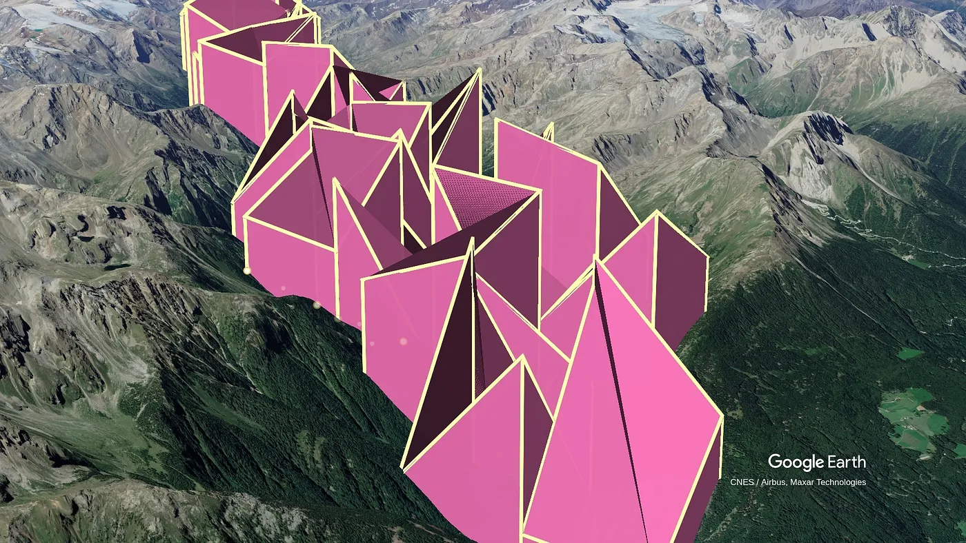
Once you know how to go about it, this looks quite interesting and powerful, as height can potentially be used for visualising data. After some further random tests (see picture), considering to include in the video some 3D bar charts, and only barely resisting the temptation of writing a tutorial on making 3D pie charts in Google Earth Studio, I was finally able to move on.

Working with layers in Google Earth Studio
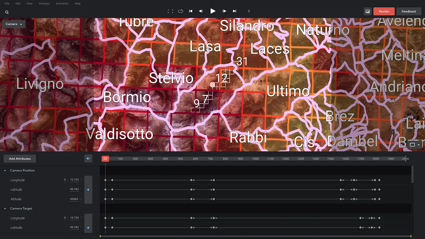
At first, Google Earth Studio seems to be fine even with large datasets and multiple layers. For the first part of the video linked above, I threw in about a dozen different overlay layers, as labels need to be added separately. While I was at it, I thought I would produce the video at 4k resolution, rather than just HD.
After some time, I realised that the preview supports only HD (so labels appear oversized while editing), and that if you re-open the saved project in a new session all layers are then shown on top of each other in the preview pane. Things looked quite messy.

Besides, layers such as the ones used in this video do not always interact nicely with Google Earth.
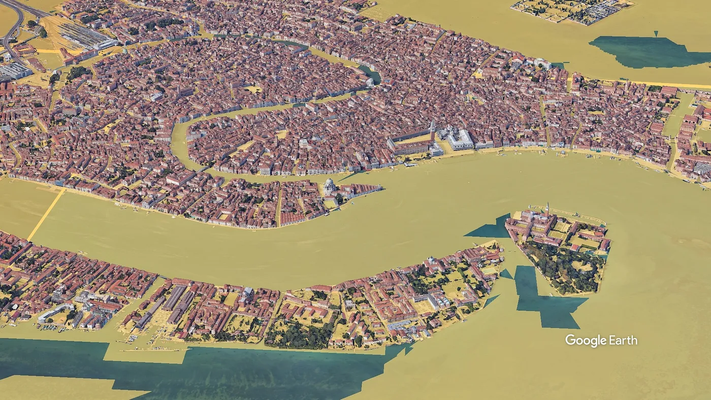
One of the fascinating things about Google Earth Studio is its capability of rendering space in 3D. This is all good, but while on mountains overlays appear nicely and follow the texture of the environment, the same is not true for cities for which Google Earth has 3D data for the buildings. Also, for some reason, some randomly shaped polygons of sea always appear over coloured overlays. You can see both artifacts in the following image:

As you see in the final segments of the video, in order to overcome this issue I had to put the layers above ground to get acceptable results.
To summarise, here are some suggestions if you want to make your life a bit easier when starting a new project with Google Earth Studio:
- unless you really need to, keep the default HD resolution (1920*1080), so what you see in the preview is the same as what you get in the rendered output
- if you make a somewhat lengthier video with different datasets showing up at different points in time, break it up in small segments. It is easy to to merge them later. With many layers, things are not shown correctly in the preview, the rendering process gets stuck or does not show progress (so you think it is stuck, even if it actually works), and the whole interface becomes slightly less responsive.
- by default, exporting requires you to keep the interface open without being able to do anything else on the computer. It also requires you to wait for all images to be generated, so that they can be downloaded as a single zip file. If, as it happens, things gets stuck, you have to start from the beginning of the rendering again. If you make a slightly bigger project and you do not have a spare computer, this is extremely annoying. So do yourself a favour: ask access to the latest beta through this form, and after a couple of days you will be given the option to export everything directly to a local folder: frames are stored directly, so you can export big projects in a single go and can do other things with your computer at the same time (this advice is valid as of August 2020; this feature will hopefully be automatically available in future versions).
- to begin with, as you familiarise yourself with the interface, you probably want to start with the “Quick start” projects to move smoothly between one location and the other.
Wrapping up
Google Earth Studio allows for the creation of video clips of stunning quality. The editing suite works directly from the browser and is usable even with less powerful computers. It has many features I have not mentioned, including importing routes for determining camera movements and setting the time of the day to make lights and shadows change. It allows to export data in a format that can be further processed by advanced users with software such as Adobe After Effects. It can also be a powerful tool for data visualisation, and can be used in short video clips to present a specific set of data or to provide some context.
However, while working on this video, I had the feeling I was somehow walking in mostly uncharted territory: if somebody got geographic data out of R, and used them to produce video clips with Google Earth Studio, they did not leave many traces online (there is however plenty of tutorials and examples on YouTube for more generic uses not related to data). Hopefully, the references included in this post will be of use to others considering to join the fun and start using Google Earth Studio as a data visualisation tool.
All files and scripts used to produce the above video are available in this repo. Files that can be used directly with Google Earth Studio can be downloaded from this link. If you see oversized labels in the preview pane, this is due to the fact that these files have been optimised for export in 4k.
All scripts used to generate the data at the base of these data visualisations are published in this repo.
